Pantone’s 2026 Colour of the Year, Cloud Dancer. The colour offers a ‘promise of clarity,’ the company said in describing its pick.Pantone
After teasing a countdown clock for days, Pantone unveiled its 2026 Colour of the Year: Cloud Dancer. The colour standards company introduced the annual proclamation in 1999 as a way to highlight the influence of colour on culture and engage with the global design communities it serves. Pantone’s first prediction launched with the new millennium, dubbing the year 2000 Cerulean (yes, the subject of Miranda Priestly’s now-famous blue sweater monologue in The Devil Wears Prada).
Cloud Dancer, the arguably dystopian non-colour, is the first “shade” of white ever selected, following the Viva Magenta and Mocha Mousse of recent years. The choice elicited widespread bewilderment.
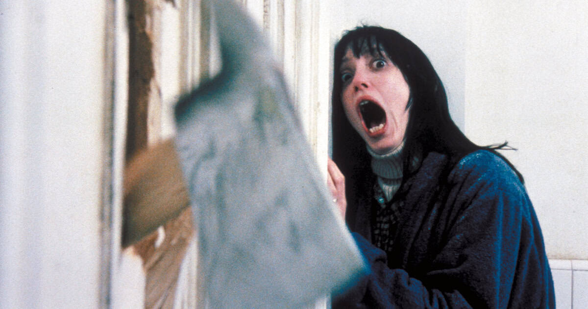
Decorators fanned themselves with swatch decks as social media seized on the entertaining meme potential, sharing images of the corridors at Lumon – the evil corporation from Severance – and dubbing the swatch, with almost affectionate derision, “Landlord White.” Think pieces ensued, unpacking what our longing for blank serenity (Pantone’s take) and stark emotional minimalism (everyone else’s) might bode for the future.
As Priestly rightly argued, colour choice is never accidental. It’s laden with meaning in the human psyche. Inside our homes, on the cars we drive and across fashion, politics, art and war, colour plays an important role in expressing and influencing behaviour.
In the case of Cloud Dancer, stark white conjures not only ideas of austerity and hygiene but sanitization – emblematic of Mussolini-era Italian modernist architecture and tied to the concept of racial purity (hence white’s strong historical associations as the colour of fascism).
In the current political climate, comparisons of Pantone’s edict to American Eagle’s dog whistle of “great jeans/genes” in Sydney Sweeney’s infamous denim ad seem justified. In a press release, Pantone executive director Leatrice Eiseman countered: “At this time of transformation, when we are reimagining our future and our place in the world, PANTONE 11-4201 Cloud Dancer is a discrete white hue offering a promise of clarity.”
Benjamin Moore’s 2026 Colour of the Year, Silhouette.Benjamin Moore
Anointing a colour of the year has become a common year-end ritual across industries – paint brands especially. Benjamin Moore’s 2026 Colour of the Year is a charcoal-tinged espresso shade called Silhouette. (The emphatically rich hue apparently takes its cue from a rising interest in bespoke menswear and tailoring). Sico, Glidden, Sherwin-Williams and Behr all have their own picks, as do design marketplace 1stDibs and social platform Pinterest.
To better understand the process behind high-level colour forecasting, I turned to Pittsburgh-based Fortune 500 company PPG. The industrial paint and coatings giant operates in more than 70 countries, with its finishes and colours saturating everything from office buildings and home appliances to consumer electronics, cookware and cars. Chances are that PPG is responsible for the eye-catching shade of your panini press, kitchen cabinets and non-stick frying pan.
PPG’s 2026 Colour of the Year, Secret Safari.Supplied
The company devotes serious resources to developing its palettes. Its annual colour conference gathers colour stylists from around the world, with its aerospace, architecture, consumer electronics and industrial design divisions all represented.
Forecasting is simultaneously diagnostic, interpretive and predictive. It’s also smart marketing. Developing custom shades helps PPG’s customers get ahead of the curve, the company’s colour styling manager for the Americas, Misty Yeomans, said. “All of our customers are competing with each other. Colour is a differentiator.”
To arrive at Secret Safari, its 2026 Colour of the Year, Yeomans recounted how 36 stylists spent a week in immersive workshops analyzing cultural shifts, collective mood and emerging influences on future colour tastes.
Chartreuse by another name, the striking botanical shade leads PPG’s complementary palette of nostalgic burnt shades such as Ginger Spice and Carrot Cake that the brand says evoke simplicity, comfort and familiarity.
“I remember after 9/11, we saw pinks and browns trending because those are comfort colours,” said Yeomans. “So we know people gravitate to these tones in times when there’s strife or trauma.”
There are pop cultural inputs to colour use, too: When Game of Thrones was popular, palettes trended dark, and PPG’s 2019 Colour of the Year was a dramatic, sooty green-black called Night Watch. Softer nature colours began to emerge during the start of the pandemic, with chestnut brown and leafy tones related to outdoor walks and forest bathing.
At Swedish automaker Volvo, new colour options typically lean toward warm neutrals, according to the company’s senior design manager Rekha Meena.Supplied
Rekha Meena, senior design manager and head of colour, material and finish at Volvo’s Gothenburg headquarters, describes the automaker’s similar approach to design direction and colour trends. All new colour options fall within a palette that typically features warm neutrals – landscape colours such as granite, sandy taupe and coastal blue. The company leans into the Nordic ethos of simplicity and harmony, using colour to evoke emotion and a sense of calm.
Just as in fashion, rich chocolate and burgundy are currently trending, and quiet luxury is a buzzword. In that vein, Volvo’s 2026 automotive exteriors come in deeper tones drawn from the outdoors, such as Forest Lake (a metallic dark green) and Mulberry Red.
But does colour forecasting bring material gains? Evaluating uptake after annual pigment declarations is a little easier to spot in the business of consumer paint colour, where a bump in sales may indicate success. In the automotive industry, where the lead time to a product release and post-mortem period are longer, it can be more challenging.
In contrast with Pantone’s colourless colour choice, designers across industries are forecasting a 2026 palette of earthy, dramatic hues, with deep browns, greens and reds leading the shift toward maximalism, eclecticism and colour drenching. In this light, Pantone either got Cloud Dancer very wrong or all too right.


![14th Dec: Tashan (2008), 2hr 26m [TV-14] (4.9/10) 14th Dec: Tashan (2008), 2hr 26m [TV-14] (4.9/10)](https://occ-0-273-999.1.nflxso.net/dnm/api/v6/Qs00mKCpRvrkl3HZAN5KwEL1kpE/AAAABVq8dcaClUoMDWll1GKK87qWrQ9q6dDweIP6WLAK5fIarcHCINWpXzN3wzJ0uve7I-9bKy9wZfroVL3H5m2Nu8Guo7ozomrCpwlQ.jpg?r=c59)


